Tuesday, November 22, 2011

Lab 7 - Census 2000


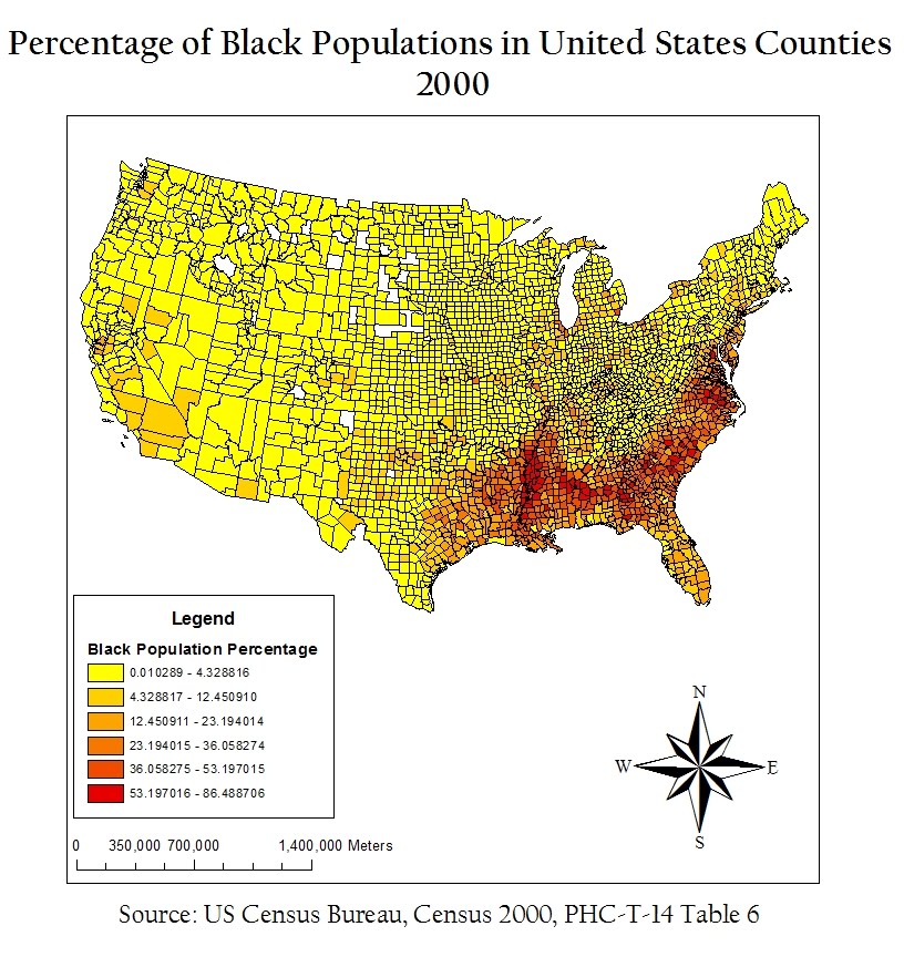
As can be seen in the “Percentage of Black Populations in United States Counties, 2000” map, black populations have a high concentration compared to other populations in the southeastern U.S. States like Mississippi, South Carolina, and Virginia have many counties with 53-86% African-Americans. Most of the rest of the United States has below 5% African-Americans represented in the populations of their counties.


In “Percentage of Asian Populations in United States Counties, 2000,” Asians have a large presence in counties on the West Coast, specifically around Seattle and San Francisco, and around some of the Northeast around New York City. What I find interesting is that no county has a population of more than 47% Asian, which is surprising considering that at many places, like UCLA, Asians are no longer a minority.


The Census Bureau has the option of “Some Other Race” as a write-in entry. For example, many people who classify themselves as multiracial, interracial, or Hispanic/Latino include themselves in the “Some Other Race” category. In 2000, 97% of the respondents who declared themselves as “Some Other Race” were Hispanic or Latino. Interestingly, only 43% of Hispanics of Latinos placed themselves in the category of “Some Other Race.” Counties in Washington, California, Texas, and New Mexico have large concentrations of people who classified themselves as “Some Other Race,” whereas most of the rest of the U.S. has less than 2% of “Some Other Race.”
These maps from the 2000 Census indicate that most minorities tend to live by some coast, whether that be near the Pacific Ocean, the Gulf of Mexico, or the Atlantic Ocean. In the middle of America, Asian, Black and “Some Other Race” do not have a high presence. This is most likely because minorities who immigrate to the United States center around major cities and ports which are generally on the edges of the U.S.
GIS is a great tool to use to display so many different types of information. I am always so excited after I have made a map that I have to show it to all of my friends. The ability to show useful information to an audience that is easy to understand is a priceless asset that GIS has imbedded in itself.

Monday, November 14, 2011

Lab 6 - DEMs in ArcGIS

Since we were working with digital elevation models (DEMs) for this lab, I decided to choose an area with a drastic changes in elevation: Mount Rainier in WashingtonMount Rainier is one of the most dangerous volcanoes in the world and is the highest mountain in the state of Washington.
The geographic coordinate system used in the DEM is the GCS North American 1983.
The extent information for this area is:
Top: 46.96°
Left: -121.98°
Right: -121.51°
Bottom: 46.69°

The following map shows a color-ramped DEM layered above a hillshade model:


This next map shows the slope of the area around Mount Rainier in degrees:


The following map is an aspect map, which shows the direction of the slope:


This last model is a 3-D image of Mount Rainier:


Sunday, November 6, 2011

Lab 5 - Map Projections in ArcGIS

The perfect map would be an exact representation of the real world; this would occur by having the ratio of the distances between any two points be the same on the map and in real life. However, this representation is not possible when portraying the spheroid world on a flat surface. There are three map projections that preserve some aspect of real life: equal area, equidistant, and conformal projections. In each map, I measured the distance from Washington, D.C. to Kabul in miles. The most accurate distance is using the Geographic Coordinate Systems, and is measured at around 6932 miles.
Equal area projections, as shown in the Goode’s Homolosine Land map and the Mollweide map, preserve area. In other words, the area on land is represented through the same ratio of area on the map. The Goode’s Homolosine Land map reported a distance of 9986 miles from Washington, D.C. to Kabul, while the Mollweide map reported a distance of 7926 miles. The Good Homolosine Land map’s distance is over 3000 miles off from the actual distance and the Mollweide map’s distance is just under 1000 miles off. Since the area is preserved and not the distance, the distance reported is clearly exaggerated in equal area projections.


Conformal projections, as shown in the Stereographic and Mercator maps, preserve shape and angles. Conformal projections are mainly used to represent a local area. To be considered conformal, the angles at any two lines on the map are the same as the angles in real life. The Stereographic map reported a distance of 9878 miles from Washington, D.C. to Kabul and the Mercator map reported a distance of 10,112 miles. Both of these distances are around 3000 miles more than the GCS distance, demonstrating that distance is dramatically changed when a map is focused solely on angles.


Equidistant projections, as shown in the Azimuthal Equidistant map and the Equidistant Conic map, preserve distance among a reference line. The Azimuthal Equidistant map reported a distance of 8341 miles between Washington, D.C. while the Equidistant Conic map reported a distance of 6972 miles. Clearly, the map projection that shows the most accurate distance between the two locations is the Equidistant Conic. However, the distance is not exactly what GCS reports because the equidistance aspect of the map only refers to the distance between two specific points on a reference line.


With the dramatic differences in distance between two locations shown above, it is obvious that choosing a map projection should not be taken lightly. Your map projection should depend on what you are representing on your map, from a distance-accurate city map to a shape-accurate world map.

Tuesday, November 1, 2011

Lab 4 - Introducing ArcGIS


My experience with ArcGIS was generally great! I really liked getting to know the program and seeing the variety of tools that could be used. For example, creating the road as well as displaying the same thing in different ways really interested me.
ArcGIS did have a few drawbacks, though. I was using ArcMap 10 when I think the tutorial was made for an older version of ArcMap. Therefore, it took me a while to find some of the tools and buttons, and I never found ArcCatelog. In addition, I feel like it will take me a long time to really get to know the program. There is so much that you can do with it that sometimes it gets confusing what steps I should take to get to the final result.
GIS has the potential to be used in every field imaginable because of its diversity and range of use. It can be helpful in determining so many things regarding distribution, location, and relationships. GIS will likely become a staple in companies and even in lower-level education.
The pitfalls of GIS include its complicated nature. Unless, like this lab, you are given step by step instructions on how to make map and how to manipulate the data, it will take a while to learn how to do it on your own. This can make it difficult to make GIS available to the masses as a viable form of analyzing data.